Phonics Workbook Cover Design
Challenge
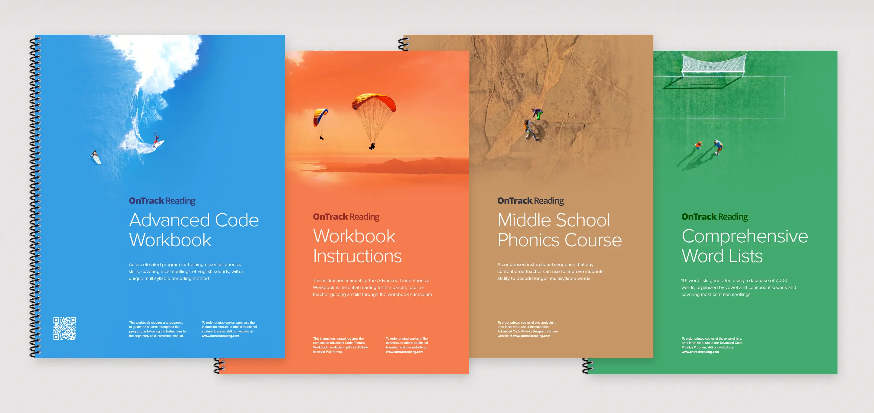
As an interventional literacy program, OnTrack Reading serves struggling readers from middle school to adulthood. Avoiding childish imagery was crucial since the workbooks would be carried around – visible to peers and to the public. The client needed materials that looked sharp and wouldn't embarrass older students.
Solution
In thinking about the teacher/student tutoring model, we came up with other creative ways to show it. A pair of surfers in the blue ocean. Two paragliders flying into an orange sunset. A soccer coach and player on a field of green. The concept perfectly captured the learning experience without resorting to clichéd imagery.
The Perfect Balance for a New Brand
Workbook design, like any textbook design, presents unique challenges. Especially when the books are part of a collection, the designs need to be cohesive yet distinct, accessible yet sophisticated, and age-appropriate for children and adults alike. In this case, it was also important that the visual system have the flexibility to work across any future materials.
The covers worked well with bold colors, clean typography, and simple title placement. The addition of small coach-and-player imagery brought the concept together, creating covers that felt both professional and approachable.
Have you outgrown your web designer?
We build custom websites for brands determined to take the lead, not copy their competitors. No generic themes or bloated plugins. Just purpose-built strategy, clean design, and modern systems that scale.
Just have questions? Send an email